
Not too long ago, I wrote an article here about advanced procedures for examining interactions in multiple regression. As I described some of the challenges researchers commonly face in trying to examine differences between people in a data set, I argued that when it comes to data analysis, splitting a continuous variable into a dichotomy (i.e. two categories) is kind of a dumb idea (MacCallum et al, 2002). At the risk of going “Full Kanye” I’m going to go ahead and quote… myself:
Dichotomizing your data… often takes the form of the well-known “median split” procedure. Basically, you’d find the median of your negativity scores, and anyone who scores above it is categorized as “high negativity” while those below it are categorized as “low negativity.” This was once a common practice (and some folks still do this on occasion), but statistically speaking, this is a pretty terrible idea. It’s well known that artificially creating categories in this way will compromise the power of your statistical analysis (see my post [coming soon!] for an explanation of precisely how & why this happens). Aside from the power issue, it’s conceptually indefensible — Where do you draw the line between high and low, and how do you make this arbitrary decision? Does it really make sense to distinguish conceptually between people who are just barely on opposite sides of the split? The short answer is, probably not.
Strong words, Mr. West.
Outdated meme: [CHECK].
Still, lots of up and coming students (and sadly, even seasoned researchers & practitioners) continue to engage in this practice. Today I’ll demonstrate why it’s a bad idea. For this lesson, I’m doing things in SPSS.
Before we begin, I should start with a bit of personal disclosure/advanced warning: This is going to get a little bit polemic. During my Master’s training and current PhD training, I was (and still am) steeped in the regression side of data analysis, so I have a slight pet peeve about the frequent use of analysis of variance (ANOVA) in psychology (in a nutshell, I think it’s a rather limited inferential procedure). My bias is fairly well known by my colleagues, and it’s probably going to show through in this article (in case you couldn’t tell already). Anyway, let’s get to it.
The Example: A teacher training program
As per usual, I’ve made all of my data files and program syntax available for download, so you can mess around with it, replicate it, and dissect it as a learning exercise if you’d like (click here to jump to the download link).
I simulated my data in SPSS for this example. I like making things concrete, so I’m giving these data some context. Here, we’re interested in figuring out how effective a new training program for teachers actually is. The program is voluntary and relatively unstructured, so teachers can sign up for as many hours as they wish, with a maximum of 50 hours of training modules available if desired.
In order to see whether this training program is helpful, we’ll look at how each teacher’s class performs as a whole on a national exam. Scores on this exam are pretty standard stuff – I specified that the average is around 80, with a standard deviation of 5, plus some additional random noise for kicks. This gives us the following simple linear regression variables:
Predictor (X) = hours of training teacher received
Outcome (Y) = class average for exam
Pretty straightforward model, right? For now, we’ll ignore the fact that there are all sorts of confounding variables that might matter here (e.g., only the most motivated teachers or those who need the most improvement would bother to participate in lots and lots of hours of training). As I have cautioned in other articles I’ve written, so shall I caution here – these are not real data. I made them up. Simulated. Fake. False. Fugazi. Phony. Illusory. Part of “The Matrix.” Existentially challenged, if you will. You get it by now. I’m just using them to illustrate a statistical point. Take it easy, folks (but good for you if you were thinking along the lines of confounding variables).
For this example, I simulated a data set containing information from 100 teachers, and made each of the variables approximately normally distributed, and correlated with each other at roughly r =.20 to .30 (i.e., a small-to-medium effect in Cohen’s (1988) classic terminology).
Here are the distributions of our two simulated variables:
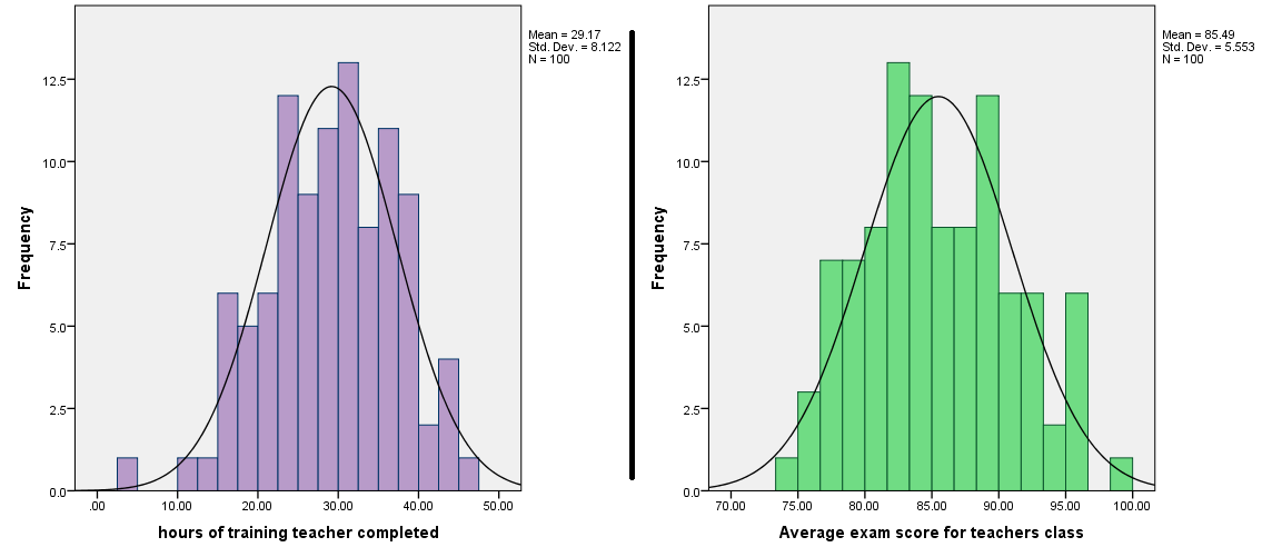
Approximately normal. So far so good.
Now how might we go wrong by splitting our X variable? I went ahead and split the teacher training hours variable right down the median in order to show you.
Median splits & the limitations of categorical data.
Many students – particularly those who have their academic upbringing in the experimental psychology tradition – use ANOVA as their go to statistical procedure for examining the effects of some treatment (X variable) on some outcome (Y variable). Now this isn’t a bad thing in and of itself (pipe down, ANOVA lovers). However, if you’re opting for this approach when the regression approach is available and feasible, you’re likely going to end up having to take a continuous variable and split it in some categorical fashion. If you do this, you’re probably doing the old-standby maneuver known as the median split, which yields categorical data that you can subsequently jam into an ANOVA. Yay. Problem is, you might be sacrificing a few things by virtue of the simplification involved in the categorical ANOVA method.
You see, when we run a regression using the categorical version of the treatment variable (as we’re about to do here with the training hours variable), what we’re effectively doing is a simple mean comparison. Usually, a mean comparison can either take the form of an independent samples t test or a one-way ANOVA with two-levels for your independent variable (or X, as I more frequently call it). This probably reminds you of intro stats. Not very exciting stuff, is it? Worse still, the findings of the regression analysis are likely to mutate into something less stellar than they were before, once we switch from a continuous version of our predictor to a median-split, categorical version of that predictor.
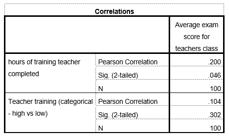
Unless your X and Y variables are incredibly strongly correlated (something like r ≥ .90), you’re probably going to end up noticeably attenuating their correlation when you dichotomize your continuous predictor. Don’t believe me? Take a look at the correlations below – r is weaker when training is categorical (technically that’s a point-biserial correlation, but we won’t get into that right now). If you repeatedly simulate these data, this attenuation of correlations happens more often than not. But why?
Ripped straight from SPSS, because I’m lazy.
It happens because of basic statistical properties of sets of scores (assuming you’re working with a normally distributed variable). Statistically, the means of your two training groups will drift toward the overall mean of your exam score variable’s distribution — more so than any single teacher’s class exam score is likely to hover near the sample mean. Kind of a mouthful, I know. But it’s true. Google it. Seriously. I’ll wait…
In fancy-pants statistical jargon, this is akin to what we call the Law of Large Numbers (it’s part of the reason that the Central Limit Theorem holds water. Both principles are just the bee’s knees, by the way). Basically, two group means are not going to be that far from the overall sample mean, on average. They tend to hover nearer to the center of the distribution, while individual scores can be more scattered. This means that when you median-split, you’re sacrificing one of the key ingredients for a delicious, home-baked regression analysis — variability. Because the group means are more likely to hover near the center of your distribution, if we draw a line connecting the low-training and high-training means, we’d end up with a flatter line than we would if we drew a best-fit line through the individual scores (which are more scattered; i.e., variable) across all values of training hours. Compare the continuous and categorical regression graphs below to see what I mean.
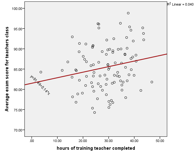
Here I used continuous training hours as a predictor:
And here I used my dichotomous training variable as a predictor. Notice how the regression line is flatter now:
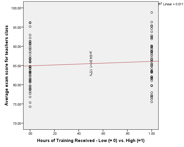
“Hello, madam. Would you like that dichotomous-predictor regression model with an extra helping of lame sauce?” “Yes, please.”
Let’s take a look at the mean differences to see what I mean when I say that group means drift toward the middle. The average exam score across all the teachers in this simulated data set was a score of 85.45. The means for the two groups below are 84.91 for the “low training” group and 86.06 for the high training group. Looking at the standard error bars, we can see that these two means are really not very different from each other statistically.
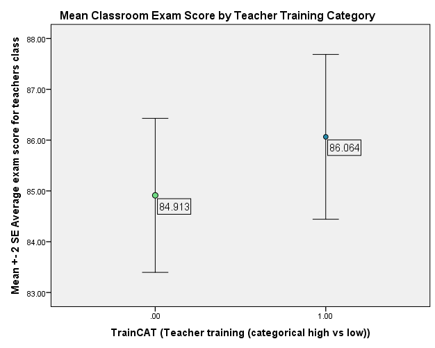
Granted, the group means graph above may be a little misleading, given the scaling of the Y axis (and we all know that improper scaling’s a bad idea when presenting graphs, right?… right?).

Image source: http://99percentinvisible.tumblr.com/post/104421136811
Fair enough. Here’s a more accurate look at the mean differences – one that actually puts the microscopic differences between the two groups into even starker relief.

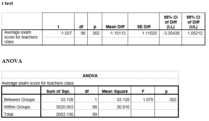
Pretty underwhelming right? And now for the actual results of the two regression analyses, to really drill this idea into your brains:

Well… shit. The categorical version of the training hours variable doesn’t have a statistically significant (i.e., different enough from zero) effect on class exam scores. How about that.

Recall from your introductory stat textbook material on simple linear regression that doing a regression using a dichotomous predictor is effectively (and algebraically) the same as doing a mean comparison (and this is why people often call ANOVA a special case of regression). So here, the intercept is just the mean for the group that’s coded “0” (in this case it’s the mean exam score for the “low training” teachers, which as we saw above was 84.91), and the magnitude of B1 just refers to the difference between the two group means (we saw that the mean of the high-training group was 86.06, so that gives us: B1 = 86.06 – 84.91 = 1.15).
Also recall from introductory regression material that in simple linear regression, the standardized effect of X on Y (or Beta [or β] ) is identical to the bivariate correlation between two variables (that is, β = r in simple linear regression). This is why the two β values in the regression analyses above are identical, both in size and p value, to the respective correlation coefficients I presented a while ago.
In practical cases, a researcher would likely conduct a t test or a one way ANOVA with data like these. I went ahead did that too (note that the one-way ANOVA is redundant, as SPSS automatically runs this when you do a regression). Here are the results (ALSO ALSO recall from intro stats that with an independent samples t test, F = t² ):
Now why, oh why, would I bother laying out all this stuff in gory detail, beating a dead horse in the process?

“Take that, dead horse. Your analysis is bad, and you should feel bad.”
Well, suppose you are a young, eager-beaver researcher who wants to develop some new program or treatment or intervention or whatever, and you collect data just like these in order to try and convince people that your new training program really works for improving student achievement. However, because you never read this article, and you’ve been toiling away in the statistical land of ANOVA, never having been exposed to other methods of analyzing your data, you split your data in order to run a simple, mean comparison-style test. Chances are, more often than not you’re going to end up missing out on an effect that really exists when you take the mean-comparisons route via Median Split Boulevard. You’re going to have a harder time defending your argument when your method is undermining your results (y no es bueno).
The counterargument: Replication?
By now you might be saying “Well, yes, this is all well and good, but you can’t really make an argument against the utility of creating categories by simulating one data set.” Good point. Any finding worth talking about is worth replicating. So let’s get our hands dirty, kids.
Let’s do multiple simulations!
This time, I used some modified syntax to simulate a shit-ton of studies in a flash (hey, you asked for it). I conducted two multiple-simulation runs here. In the first run, I simulated the same two random, normally-distributed X & Y variables across 100 separate data sets using a loop block, and re-ran the two regression models across each of the 100 data sets (with results-compiling syntax added for presentation purposes). This is effectively like running 100 independent studies of 100 teachers, with an effect size of about r = .25. That was just the first simulation run. Unsatisfied with the meagerness of this approach (obsessive researcher alert), I did it again, this time using 1,000 simulations instead of 100 (with the same sample size & effect size specifications). Effectively, it’s like I’m working with a giant sample of 110,000 teachers here, with complete data. Ain’t simulation cool?

Below, I present the results from the 1,000-simulation run only (though both are included in the downloadable files). I compiled the regression results from each of the 1,000 analysis runs in Microsoft Excel. Perhaps unsurprisingly, more of the models using continuous training hours as a predictor showed statistically significant effects, compared to models using categorical training group as a predictor.
Here’s the final score:
Continuous training hours X = 688 significant βs out of 1000
Categorical training group X = 453 significant βs out of 1000
Note that in the screenshot below, I truncated rows 11-979 so that the whole table could be seen in one image. All the information is pretty redundant anyway, so I doubt you care to see every single row (though it too is available among the files I’ve posted online). The p values highlighted in green are all at or below the accepted NHST standard of .05.
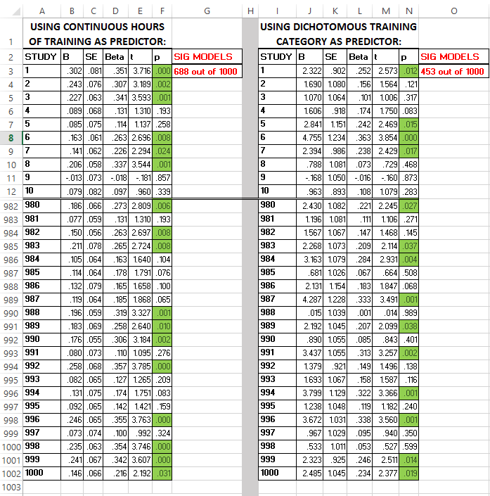
Click the image to enlarge.
Conclusion:
So what we’ve seen here is that there is a very real statistical compromise involved in taking a continuous predictor and turning it into a dichotomy via the old-fashioned median split method. In a nutshell, when you perform a median split with simple OLS regression, you end up simply comparing group means, instead of examining an effect across all represented values of a predictor. This sometimes results in a lack of meaningful effects in terms of NHST, despite the fact that there could still be a real effect of your treatment (i.e., a nonzero slope) across the continuous range of its values (note that there could actually be fluke cases where the categorical predictor tests as significant while the continuous predictor doesn’t, but this is less likely than the reverse). What a shame. And keep in mind, this is a median split, which is actually the least extreme form of dichotomization there is. If we split things differently – say top 20% vs. bottom 80% – the results can get even worse.
So why does this matter? Sadly, some students and even more senior researchers (especially those trained exclusively in experimental psychology) are prone to default to ANOVA-based methods when conducting research. This is fine when you have a legitimate categorical predictor variable (e.g., distinct experimental conditions). However, when a treatment or manipulation involves something more akin to a continuous dosage model (as seen in the current example), that experimental way of framing your methodology can be more of a pitfall than a boon – especially if you succumb to the call of dichotomizing variables in order to run an ANOVA or a t test. Through this and other examples, you can begin to understand that ANOVA really is just a special and rather limited case of regression (a sentiment that’s been echoed about a bajillion times over the past several decades).
My advice? Consider going the regression route any time you have a basic X –> Y relationship to explore… and do not categorize your continuous variables unless you can satisfy two criteria:
- It is absolutely necessary for interpreting your results (e.g., only one or two of the values of your predictor actually have a real meaning, or group means are what you’re legitimately interested in).
- It actually makes conceptual sense to split the data in half (this is the harder criterion to satisfy, for reasons I laid out in my previous article).
Short of the above, save the median splitting for the less savvy researchers.
…and keep your statistical interpretations clear of the DANE-JAH-ZONE.

Sound advice, Mr. Archer.
REFERENCES:
Cohen, J. (1988). Statistical power analysis for the behavioral sciences (2nd ed.). Hillsdale, NJ. Erlbaum.
Click here to download all files used in this article (hosted by Google Drive).

Pingback: Advanced topics: Plotting Better Interactions using the Johnson-Neyman Technique in Mplus | Fred Clavel