Welcome to another stupidly-long, but hopefully informative instructional on introductory statistical concepts. Today we tackle regression analysis. Use the menu links below to jump around if you need/want to get a quick bit of info on any topic:
Menu
1) Background: Correlation analysis [conceptually] explained
2) Correlation analysis and OLS linear regression
3) From guesses to predictions: The logic of using linear regression
— a) Building the equation
— b) Interpreting regression
— c) What is OLS?
4) Advanced Applications
5) Conclusion & Further reading
Intro/Rationale
Over the past several semesters, I’ve been teaching aspects of basic statistical analysis to undergraduate students, and loving it. My adventures in the classroom have been a healthy reminder of how challenging (but also rewarding!) it can be to provide a clear understanding of many of the core topics in statistics, methods, and measurement – things we often take for granted once we’ve acquired more experience. Frankly, sussing this shit out can be often be more confusing than trying to figure out an Escher drawing, especially for those who are in their rookie year.

Relativity by M.C. Escher. What statistics can look like to an up and coming student… I know. I’ve been there, friends.
One major topic that I cover regularly is regression analysis. Regression is one of the essentials of statistical analysis, lying at the heart of lots of other GLM-based analytic techniques (e.g., ANOVA, multilevel modeling, SEM). Entire courses are dedicated to it at many campuses. Helping students understand all of the capabilities and nuances of regression can sometimes be a challenge. For me, it can be especially challenging when I’m only afforded one or two class sessions to convey this material to students who may have never had extensive exposure to it. After all, how do you impress upon your up and coming students the importance and utility of regression analysis in a matter of under 10 combined hours? Write your own instructional on it, of course (that’s what blogs are for, y’know).
So here I’ll outline the nuts & bolts of linear regression, from correlation analysis to [slightly] more advanced applications. This is designed with the student learner in mind. For those of you with more advanced background, this stuff will be old hat, and I will likely gloss over some things in a way that will make you shake a fist (pipe down). Still, you might find this content useful if you’re looking to instruct undergraduate learners (or to just refresh your grasp of regression). Oh yeah, and it will involve pictures and graphs. Fun stuff.
Let’s get started with the basis of regression — correlation analysis.
1) Background: Correlation analysis [conceptually] explained
When we want to examine the relationship between two variables, correlation analysis (or let’s just call it “correlation” for ease) is a logical place to start. Correlation involves taking pairs of scores on a pair of variables and seeing the ways in which scores on the two variables tend to change together (or in some cases, seeing how they fail to change together). Correlation is an inferential statistical procedure. This means that it’s a technique that allows us to use data from a sample to make inferences about how two variables are related to each other in the population.
When we run correlation analysis, we’re taking information about one variable and pairing it up with corresponding information from another variable (from the same people – or couples, or workgroups, or classrooms, or teams, or neighborhoods, or whatever your unit of analysis happens to be). The ultimate goal is to see whether or not scores on the two variables tend to change in the same way (also known as covariance). Information about how scores change together (or covary) tells us something about how the two variables are related.
Still don’t get it? OK… example time!
TODAY’S EXAMPLE:
Word use and Attractiveness Online.
I’ll be simulating data once again, as is my usual M.O. However this time around, I’m taking the grossly simple route and doing this in Excel. I figured a simplified example using a handful of cases should be enough to give you a basic understanding of regression.
Let’s say we’re examining the relationship between the number of words a person uses in the “about me” section of their online dating profile, and the ratings of attractiveness they receive from other users of the fictional dating site.1
In my file, I randomly generated scores for the word use variable ranging between 50 and 500, while attractiveness ratings fluctuate between 1 and 10, as a function of word use (using a very rough RNG-based formula that builds in random error).
So now we have two variables. Let’s call them X and Y, because that’s standard GLM lingo:
X = number of words on a profile
Y = attractiveness rating
You may have noticed that these two variables are on pretty different scales (1 to 10, versus 50 to 500). One of the nice things about correlation and regression analysis is that the scaling doesn’t really make a huge difference as long as you’re dealing with two continuous variables (as opposed to discrete variables that contain nominal categories like “Male/Female” or “Yes/No” or “Single/Cohabiting/Married”). There are ways to deal with analyzing discrete/categorical variables too, but we’ll see that much later below.
So let’s say we have information from the profiles of 16 people on this fictional dating site. Half are women, with the other half being men. Because this is a small data set, we can look at their actual scores in order to make things concrete:
 Because this data set is so small, I created it directly in SAS in order to run my analyses. I’ve included my SAS program below, so students can just pop the program code into a SAS editor window, click run, and see exactly what I did & what I saw. Or tinker around with it if you’re so inclined.
First steps. We can start off by examining the descriptive statistics for these variables:
Words Used:
Mean = 297.81, SD = 119.27
Attractiveness Rating:
Mean = 4.40, SD = 2.70
You may have also noticed that there are two “sex” variables – one with “M” and “F” designations (for male and female, in case you couldn’t guess), and another with ones and zeros. The second one is an example of quantification — a common practice in dealing with categorical data (sex or gender is arguably the most common categorical variable you’ll come across in any data set in psychology). Basically, I arbitrarily assigned the men and women numerical codes of zero or one – in this case a “1” means that the subject is female (hence the variable name “Sex F”). This wil be useful for later analysis.
2) Correlation analysis and OLS (Ordinary Least Squares) linear regression
Now that we have basic descriptive information on these two variables, what’s next? Well ordinarily, knowing the average word use or average attractiveness ratings is kind of a “who gives a shit?” situation. It’s interesting information (I guess), but doesn’t really tell you anything of practical significance about how the dating site users are judging each other’s attractiveness. This is where correlation analysis comes in.
The logic of correlation is simple – for every score a person gets on one variable, let’s look at that same person’s score on another variable. Next, let’s do that for everyone in the data set, and see if there’s a pattern that emerges.
The correlation coefficient – r
Now, because this is statistics, we can’t very well just describe the pattern in words. Screw that. Words are for chumps. We need a number that will do that job for us. That number is the Pearson correlation coefficient, which is denoted by the letter r.
While the concept of correlation is pretty simple, the formula used to calculate the Pearson correlation coefficient is not. Behold the madness:
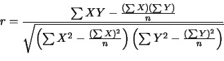
Be thankful I’m not trying to teach you this shit. I mean, look at this thing. Seriously… well OK, to be fair, it looks worse than it actually is, but still… damn, son.
Now, if you’re a student learner, sit up and pay attention, because this is the part that confuses the ever-loving shit out of many young students in my experience.
The value of the correlation coefficient (r) will range between -1 and 1. Correlation coefficients have two key features that tell you about the relationship between two variables: Magnitude and direction.
Magnitude — The strength of the relationship between two variables. Higher magnitude means that the two variables are more closely related to one another. Magnitude is based on how close the absolute value of the correlation comes to |1|. In other words, if you’re trying to assess how strongly related two variables are, you can ignore the sign of the correlation coefficient (i.e., doesn’t matter whether it’s positive or negative).
So what this means is that if two variables A & B have a correlation of r = -.45, and two other variables C & D have a correlation of r = .45, The relationship between A & B is just as strong as the relationship between C & D. It doesn’t make the least bit of difference that A & B are negatively related. The magnitude [or strength] is the same (in this case it equals |.45| — and for those that don’t know, the two vertical bars around .45 there indicate that I’m referring to the absolute value. Absolute value simply means I’m ignoring the sign of the number).
By that logic, we can also see that any correlation that is close to or equal to zero tells us that there is little to no relationship between two variables.
THE MOST COMMON MISTAKE: Many new students get this part wrong, often concluding that a negative correlation indicates that two variables share a weak relationship or that the two variables are uncorrelated. THIS IS WRONG. Wrong wrong wrong. So wrong. Wrongy McWrongface. WRONG. Please see the above. And never make this mistake. Seriously. You’ll thank me.
Direction — The nature of the relationship between two variables. This is where the sign (negative or positive) comes into play. The sign of the correlation tells us about the way in which the two variables are related. If the correlation is positive, that tells us that in general if a person has a high score on one variable, they tend to have a high score on the other variable too. Similarly, if a person has a low score on one variable, they tend to have a low score on the other variable too. On the other hand, if the correlation is negative, that tells us that the two variables are inversely related to each other. So, if a person has a high score on one variable, they will tend to have a low score on the other variable, and vice versa.
Está claro? Bien.
BACK TO OUR CURRENT FINDINGS:
In our example, the correlation between words used and attractiveness ratings is r = .64. This is a fairly strong positive correlation (yes, I’m using Cohen’s suggestions here), suggesting that in general, those who have high word counts also have high attractiveness ratings.
Why combine information from two different variables?
The longer-term goal of correlation analysis is to allow us to make educated guesses about people’s scores. If we want to make these guesses, it is always helpful to have information about people’s standing on a second, related variable. Why? Well, simply put, if we only have information about the variable we want to make educated guesses about, we are left at a pretty large disadvantage.
The Disadvantage of Using a Single Variable to Make Inferences
To return to the example above, we have sixteen individuals who were rated in terms of attractiveness. Recall that the average attractiveness rating in the total sample is:
Attractiveness: Mean = 4.40, SD = 2.70.
Suppose for the moment that this information on attractiveness is the only piece of statistical info we have at our fingertips. Now along comes our friend, Paul, who also wants to join the dating site. Paul asks us for our expert opinion on how attractive people will think he is. Assuming that all users are coming from the same population, and that attractiveness ratings are normally distributed (more info on this in the paragraph below), we can try to guess what Paul’s attractiveness rating will be. Our best guess for his score in this situation would simply be the average of the scores we already have. In this case, the average is 4.40. On a graph of all 16 scores, it would look like this:

This is about the best we can do for Paul. We could also give him an idea of the range into which he might fall, by using the standard deviation (in this case, it was 2.70) to construct probable ranges (very similar to confidence intervals in theory). Again, if we assume that attractiveness ratings are normally distributed in the population, we can calculate the middle 68% of the attractiveness distribution by adding and subtracting one standard deviation to & from the mean ( Mean ± SD(1) ). Doing so would look like this:
Lower limit = Mean – SD(1) = 4.40 – 2.70 = 1.70
Upper limit = Mean + SD(1) = 4.40 – 2.70 = 7.10
We could actually graph this too, if we wanted. Check it:

So in this case, we could tell Paul that 68% of people rate between 1.70 and 7.10. Assuming Paul is neither bewilderingly unsightly nor unreasonably handsome, this estimate is a reasonable guess for where Paul’s score is likely to end up. This guess is great and all, but honestly if we tell Paul “Hey, man, you’ll probably be rated between roughly a 2 to a 7,” Paul is likely to meet that information with the same response we saw earlier – “Who gives a shit?” Practically speaking, this is a fairly wide range of scores, and it still isn’t doing our friend Paul a whole lot of good in helping him figure out how to create the most attractive profile possible.
Truth is, we can do a more precise job of figuring out what Paul’s actual score will be by using other pieces of information about Paul to predict what his score will be, rather than making broad guesses based on what’s average.
3) From guesses to predictions: The logic of using linear regression
As we saw earlier, the average attractiveness score on this dating site is around 4.40… or at least this is what we can infer from our small sample of 16 people. However, remember that we have another piece of information about the 16 individuals in our sample — the number of words they used in their profiles.
If we put those two pieces of information together, we obtain a correlation coefficient. In our case, the two variables (Attractiveness and Words Used) were positively correlated (r = .64, p <.01). The results of that analysis are below, modified from SAS (the correlation of interest is highlighted in green):
Each entry contains:
1) Pearson Correlation Coefficients, N = 16
2) Prob > |r| under H0: Rho=0 (AKA the p value)
------------------------------------------------------------
                                       Words        Attract
------------------------------------------------------------
Words                              |  1.0000        0.6434 |
Number of Words Used in Profile    |  ----          0.0072 |

Attract                            |  0.6434        1.0000 |
Attractiveness Rating (1-10)       |  0.0072        ----   |
Putting all of this side by side visually, we get a graph that starts to tell a more precise story of how we can figure out what our friend Paul’s attractiveness rating might be. The graph below is a scatterplot, which is the standard way of viewing the relationship between two variables by pairing their scores up for each person in a data set.

Scatterplot of attractiveness ratings for each person, paired up with their word use scores. Does it look like there’s a meaningful relationship between the two variables?
Given this new information, if Paul asked us what we think his attractiveness rating might be, our default answer should no longer be the mean score of 4.40. Instead, the better answer would be “it depends.” In this case, it depends on how many words Paul has used in his profile. As we can see from the graph above, it does not make much sense to just guess the average and call it a day. Glancing at the graph above, it seems a persons attractiveness score has a tendency to be higher when their profile contains more words. Knowing this, we would want to know how many words Paul actually used in his profile so we can mathematically predict his attractiveness rating, rather than making an educated guess.
This is where regression analysis comes in.
3a) Building the equation
First we need to know what we are trying to predict, and what we are using to predict it. This information allows us to fill in the core elements of the regression equation.
The basic form of the regression equation is as follows:
Y = a + Bx
Here’s how it breaks down:
- Y = the predicted score on the outcome variable AKA the dependent variable (in our case, attractiveness)
- a = the Y-intercept. This is predicted value of Y when x is equal to zero.
- B = the slope associated with the x variable. This slope is commonly called the effect of x on y (other common names include the B weight or just B, or sometimes even Beta [but Beta only applies when it’s standardized, which we aren’t effing with today]).
- x = The score on the predictor variable AKA the independent variable (in our case, words used in a profile)
What we’re doing mathematically is using values of X to predict the value of Y. In our case, we’re using values of our “words used” variable to predict values of attractiveness ratings. The predictive power of this equation rests on the fact that there is a meaningful correlation between X and Y.
Conceptually, what we’re doing is we’re trying to draw a straight line through the data that best models the relationship between X and Y (this is also known as fitting a line to the data). This is why this kind of regression analysis is referred to as linear regression, and why the regression equation itself is referred to as a model. What that line gives us is a precise set of predicted scores on the outcome variable (Y, or attractiveness rating) that are associated with existing scores on the independent variable (X, or words used in a profile). When we use regression in this way, we end up with a prediction equation.
After running the regression analysis in SAS, we get a prediction equation. The graph below gives us a picture of the linear model itself as it’s slicing its way right through the scatterplot of attractiveness ratings and word use values, plus the prediction equation associated with the line.

In our case, we got the following regression equation from SAS:
Attract = .0671 + .0145 Words.
You might be staring at this equation and wondering what this actually means. You aren’t alone. Let’s break it down.
3b) “What does it mean?”: Interpreting the regression findings
So now that we have an equation, we can give our friend Paul some concrete and useful information about his attractiveness rating.
Recall that the form of the standard regression equation is as follows (head back a few paragraphs if you’ve forgotten what these symbols mean):
Y = a + Bx
SAS gave us the following:
Attract = .0671 + .0145 Words.
Putting them up against each other, we start to see what the SAS equation is telling us:
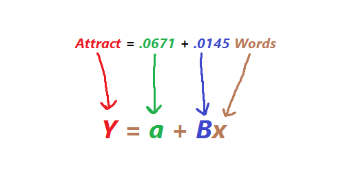
See how each piece of the SAS equation is represented by the standard formula?
Here’s another thing that most beginning students confuse commonly – the B values. The most important/theoretically interesting part of any regression analysis is the B values (AKA the effects). Here’s a definition to commit to memory:
The B value is telling us how much Y will change each time the X variable goes up by 1 unit.
Got it? Good.
Here are some common incorrect interpretations that new students tend to make:
- The B value is the value of the X score (WRONG)
- The B value tells us how much X changes when Y goes up (WRONG – this is a backwards interpretation of the correct definition)
- The B value is the correlation between X and Y (This is only correct if both X and Y are standardized. Otherwise, it’s WRONG – it’s even wrong-er when we’re dealing with MULTIPLE regression, which we’ll look at a bit later).
So, based on the definition and what we know about the standard regression equation, we now know that the equation we got from our analysis is telling us the following:
- The regression line BEGINS at an “Attractiveness Rating” value of .0671 (the intercept)
- That intercept value of .0671 has practical meaning as well – Specifically, it is the predicted attractiveness rating for a person who uses ZERO words in their profile (because who the hell likes someone with a blank profile? Honestly?). This is how you always interpret the intercept value in a regression analysis. It makes perfect sense if you do the math:
- –> .0671 + (.0145 x 0) = .0671 + 0 = .0671
- Each time the score on the “Words Used” variable goes up by 1 unit, The Attractiveness Rating is predicted to increase by .0145. In other words, for every word a person adds to his/her profile, the regression equation predicts that their attractiveness rating will increase by about 14.5% of 1/10 of 1 point.
Doesn’t seem like a whole lot, does it? Well, to make this even more tangible and practical, simply multiply the word count by 100 to get a more appreciable change in attractiveness — this means that if you added 100 words to your profile, your attractiveness rating is predicted to go up by about a point and a half (or 1.45 points out of 10).
You can see all of these pieces of information directly in the regression graph. I’ve recreated it in Excel so it’s easier to read. Check it (click on the image to enlarge for better reading):

From the equation Y = a + Bx:
Each time we add 100 words (the x value), the predicted attractiveness score (Y) increases by 1.45 points (the B value). Now you see why the B value is called the slope – it’s giving us concrete information about the angle of the line.
The information above – and particularly #3 – is the whole reason we run regression analysis. When Paul comes along and asks us what he can do to better his chances in the dating sphere, this is what we should tell him. This is information that he can actually put to good use (and maybe find himself a great romantic partner in the process).
How about that? Using statistics to solve real problems and help real people do real shit. That’s what’s up.
One additional piece of info – The R square (R2).
In addition to those B values, a regression analysis will earn you an important value known as the R square (also known as the coefficient of determination). This number is a proportion (so it will always be between one and zero, and we can turn it into a percentage by multiplying it by 100). To be more exact, it is a measure of the proportion of explained variance. What it tells us specifically is how much of the variability in scores on the outcome variable is explained by people’s scores on the predictor variables in our regression model.
In this model we got an R2 value of .41 (you can see it in the first SAS regression graph, along the right hand side where it says “Rsq”). This means that the regression model explains 41% of the variance in people’s attractiveness ratings. In cases like ours, where we have one predictor and one outcome, the R2 is literally just the correlation between X and Y squared. Seriously. Do the math. Attractiveness ratings were correlated with words used at a value of r = .64, remember? Well in that case:
r2 = . 64 x .64 = .41 = R2
Pretty straightforward stuff.
3c) What OLS regression means and why we do it the way we do it.
The technical term for the kind of regression analysis I’m running here is OLS Regression, which stands for Ordinary Least Squares. You may have noticed that I rambled on for a bit above about fitting a line to the data. What exactly did I mean by that? Well think about it this way — suppose we didn’t have a program to do the work for us, and instead we had to draw the line ourselves, using a plain old paper and pencil. What line would you draw? How would you come up with your line?
My guess would be that you’d try to draw a line that’s placed in a way that minimizes the distance of any of the data points from the line itself, right? This makes sense if we’re trying to describe the relationship using one straight line. Think about it, does the line below make sense?

The reason that the regression above is a bad fit should be obvious (especially given my colorful annotations). The best fitting line (i.e., the best fitting regression model) will be the one that minimizes its average distance from all of the data points (along the Y axis — remember, it’s the outcome variable we’re interested in). In technical terms, this is calculated by squaring the amount of Y-axis distance each data point has relative to the regression line itself (these are what we call residuals, so called because they are what’s left over after you subtract the predicted score from the actual Y-variable score), and then adding up all of the squared deviations to obtain a sum of squared residuals. The sum of squared residuals is then divided by the total number of Y-variable scores you have (usually this will be the number of participants in your data set), to give us a single value for our regression model — the residual variance. Here’s the formulaic breakdown:

The residual variance for the regression line is a useful value. It allows us to determine the amount of error the regression line contains (in other words, a number that tells us whether our regression line tends to be pretty consistent with the data points, or whether the regression line tends to be wildly off target).
In general, the best line is the one that contains the least squares (as in the lowest value for the sum of squared residuals). Hence the name – Ordinary Least Squares (OLS).
In fact, this concept of error in regression is so important that it is actually part of the standard regression equation (a part that I have not included here so far). Normally it would look like this (where e denotes some amount of error in the prediction – i.e., the standard equation assumes that the prediction is never perfect):
Y = a + bX + e
I’ve left this part out intentionally, both for the sake of time, and to emphasize the most theoretically interesting parts of regression analysis. I’m sure any stat purist reading this has been groaning this whole time because of the absence of the error term. Like I said at the beginning – pipe down.
4) Advanced application: Multiple regression – What if we have more than one piece of information?
The analysis we’ve done so far is an example of what we call simple linear regression. It’s called “simple” because it just contains one predictor variable and one outcome. More commonly, real research involves figuring how a bunch of different predictor variables relate to some outcome a person is interested in studying. When we have two or more predictor variables in the mix, the simple regression transforms into multiple regression (as in “multiple predictors”).
I won’t go into Multiple Regression in gross detail here, but here are some key ways it differs from simple linear regression:
1. The formula basically looks the same as before, except now we are adding new pairs of X’s and B’s to it. In this case, you are predicting Y by using scores on X1, X2, X3, and so forth. The new B’s are the effects that are associated uniquely with each one of the X variables. Each new multiplied combo of an X variable score and the B value associated with it is added to the standard regression equation, and denoted with subscripts so we know which ones are which. As an example, if we have three predictor variables, the equation would look like this:
Y = a + B1X1 + B2X2 + B3X3
2. Because there are multiple B values, there are multiple slopes (i.e., multiple lines of prediction to consider). As a result, creating a graph of a multiple regression model quickly becomes difficult. If you have two X variables, you can cook up a fancy-schmancy 3-dimensional X-Y-Z plot. With three or more X variables, don’t bother. Trying to graph it is like trying to divide by zero. I wouldn’t recommend it unless you enjoy headaches.
3. You will also get an R2 value for a multiple regression. It is interpreted the same way as before – it’s the amount of variance in the outcome that your regression model explains overall.
- Also, note that the more predictors you throw into a regression analysis, the higher R2 becomes. In fact, except for in rare cases of weird statistical anomalies, the R2 can only increase if you add more predictors to a model. This is one reason that R2 is a shitty measure of effect size for regression – you can theoretically push R2 way up by throwing a bunch of dumb, garbage variables that are barely related to your outcome into your model. Those trivial relationships will keep cumulatively increasing your R2 value in a way that isn’t meaningful. If you come across a published paper that claims the R2 demonstrates an effect size for the predictors used, beware – you just might be reading crap research. So be thoughtful about what you use in regression.
4. Note that there is still only 1 intercept (a) in multiple regression. This is the predicted value of Y when ALL of the X scores equal zero. Which brings me to another important point – probably the most important point in fact…
5. The B values associated with each X variable are adjusted for the other predictors in the equation (often people refer to this as “controlling for” other variables. That language is technically incorrect in most non-experimental cases, but that’s a conversation for another day).
What this adjustment means mathematically is that the B value for any X variable is the estimated addition to Y when all the other X variable scores are held constant at zero.
We can demonstrate this last point (last time, I promise!), by going back to our attractiveness and word use data. Remember earlier when I mentioned that I created a quantitative variable that denotes a person’s sex using ones and zeros for later analysis? This was why.
We can run ANOTHER regression analysis, this time adding the quantitative “Female” variable to the mix to see whether or not one’s sex also predicts how people rate attractiveness. 2 The results (from SAS) are below:

Note that the p value for the effect of “Female” is not significant (see the column that reads Pr > |t|). In this case it is above the standard desired p value of less than .05. (p = .25 in this model).
The prediction equation for this multiple regression would be as follows:
Y = a + B1X1 + B2X2
Which becomes:
Attractiveness Rating = Intercept + B1(Number of words used) + B2(Participant’s Sex)
… and with the results above, equals (the B values are highlighted in green):
Attractiveness Rating = 1.28 + .013 (Number of words used) + (-1.33) (Participant’s Sex)
Again, in multiple regression, each B value assumes that all the other ones in the equation equal zero (i.e., they’re held constant). The “Female” variable here is coded 0 for men, 1 for women to indicate a participant’s sex. When a variable uses two codes like this it’s called dummy coding. Dummy coding is arguably the most simplistic way to handle categorical variables. It allows us to compare one category in a variable to all the other categories that exist for that variable. So, if you have a categorical variable like “Sex” in your model, the group that equals zero – in this case male participants – is what we call the reference group. In other words, the B value associated with the dummy coded variable should be interpreted relative to the reference group.
We have two findings in the current model. In these data, each additional word in a user’s profile predicts a small increase of .013 points in attractiveness ratings (That’s B1). This also means that each one point increase in “Female” predicts a decrease of 1.33 points in attractiveness rating, when word use is held constant at zero (That’s B2).
By now you may have sussed out what this actually means in practical terms (kudos if you see where I’m headed with this). It highlights an important point about using dichotomous categorical variables (i.e., two categories) with dummy codes in multiple regression analysis. The B value that you get for a dummy coded predictor in multiple regression is an estimate of the difference in intercepts between the two groups (remember, the other predictors are held constant at zero). In other words, when we do the math, we are essentially getting two different intercepts for the different groups. For this reason, a regression model of this sort is sometimes referred to as a random intercepts model. Meaning, while the slope of “words used” (B1) is the same across all groups, the two groups are starting out at different levels.
Here’s what this means in the current data set:
-
- The B value for “Female” means that when “Female” equals 1, attractiveness ratings are predicted to go down by 1.33. In this data set, a “1” means the participant is female — in other words, there is a tendency for women to be rated lower here. The good news is, that B value was not statistically significant (the p value = .25, and the confidence interval included zero, which is no good for drawing meaningful conclusions). Also, these are fake data, from 16 imaginary people, so who gives a shit, really.
Doing the math, we see what those two different intercepts are:
Attractiveness Rating = Intercept + B1(Number of words used) + B2(Participant’s Sex)
Which becomes (remember that “words used” is held constant at zero):
Attractiveness Rating = 1.28 + .013 (0) + (-1.33) (Participant’s Sex)
Which reduces to:
Attractiveness Rating = 1.28 – 1.33(Participant’s Sex)
So the intercepts for men and women are as follows:
For men (“Female = “0”): Attractiveness Rating = 1.28 – 1.33(0) = 1.28
For women (“Female = “1”): Attractiveness Rating = 1.28 – 1.33(1) = -.05
This raises one final point about regression analysis: It is possible to get predicted values that are unrealistic for your data. Here, the estimated intercept for women is negative, which is technically impossible – remember, attractiveness is rated on a 1 to 10 scale, so any value below 1 doesn’t actually exist here. This kind of weirdness happens because regression analysis extrapolates intercept values from your data, whether those values are real or not. It’s all about where that line hits the Y-axis, on the graph. Often, this is remedied using a procedure called centering, but that’s something that I’ll probably cover in another post (it has more to do with statistical interactions than the simple effects that we’ve been looking at). Still, something to keep in mind when looking at your own data.
Conclusion & Further Reading
I hope that this has illuminated for you up-and-coming students some of the ins and outs of regression analysis. It is by far one of the most useful and essential tools in statistical analysis, and is at the heart of research across many areas in the social sciences. It can be flexibly modified to fit an insanely large array of research questions and research designs, including crazy complex stuff like structural equation models, and the good, old-fashioned three-level multilevel models that I’ve run in my own research.
Further reading. One of the finest resources for learning more about regression analysis (and the tome that kept me warm at night during my regression upbringing) is Cohen, Cohen, West, & Aiken’s classic text. 3 According to Google Scholar, it has been cited an absurd number of times (over 130,000), and with good reason. It covers the hell out of everything here, plus lots more. If you don’t have it already (many of us psych nerds have a copy resting on our shelves), it’s worth getting your hands on it. It’s a dense read, but it’s about as good as it gets for learning this stuff.
As with most things in statistics, the more you use it, the more you master it. So if you’re planning a research project for your current or upcoming classes, a senior thesis or independent research project with your lab, give some thought to a project that utilizes regression analysis. It can be run very easily in most standard stats programs, and is a stats weapon that’s well worth learning to wield. Go forth, and regress.
Have fun, y’all.
1 I have no idea whether these two things are actually correlated. Perhaps others do.
2 I make no empirical claims about whether these two things are actually related either. These are fake data, simulated pretty randomly, so don’t read anything into it. And even if they were, 16 people hardly constitutes a good data set for interpretation, right? OK. Cool.
The SAS Program for this example:
You can easily create and analyze these data in SAS by copying and pasting the program below into the SAS editor window and clicking run:
data regprimer;
input Sex$ Female Words Attract;
datalines;
M    0    278    3.29
F    1    272    1.23
M    0    231    3.90
F    1    293    3.53
M    0    288    4.48
F    1    92    1.72
M    0    498    8.83
F    1    307    3.88
M    0    325    7.81
F    1    119    3.29
M    0    451    5.12
F    1    492    8.21
M    0    254    1.70
F    1    362    1.22
M    0    354    9.13
F    1    149    3.01
;

run;
*View data set to ensure it was written correctly;
proc print label;
label Words="Number of Words Used in Profile"
      Attract = "Attractiveness Rating (1-10)";
run;

*DECSCRIPTIVES;
proc univariate data=regprimer;
label Words="Number of Words Used in Profile"
      Attract = "Attractiveness Rating (1-10)";
var words attract;
run;


*CORRELATION;
proc corr data=regprimer;
var words attract;
run;


*REGRESSION;
proc reg data=regprimer;
model Attract=Words/p clb;
plot attract*words;
label Words="Number of Words Used in Profile"
      Attract = "Attractiveness Rating (1-10)";
title 'Simple Linear Regression: Using number of words to predict Attractiveness ratings';
run;


*Multiple regression including SEX;
proc reg data=regprimer;
model Attract=Words Female/p clb;
plot attract*words;
label Words="Number of Words Used in Profile"
      Female="Participant's Sex (1=Female)"
      Attract = "Attractiveness Rating (1-10)";
title 'Multiple Regression: Using number of words and Sex(M-F) to predict Attractiveness ratings';
run;

You must be logged in to post a comment.