
Few things in the sciences have the near-universal power to stoke the fires of contentious scholarly debates than the subject of null hypothesis significance testing – or NHST. Across many scientific disciplines NHST is the standard way in which we determine whether or not our research findings are worth talking about.
The basic idea behind NHST is simple enough – you formulate some kind of hypothesis (e.g., the more hours you listen to Mozart the higher your IQ will be) and then you test that hypothesis against its competing null hypothesis (e.g., listening to Mozart has no effect on your IQ). You decide how you’ll test this hypothesis, then you set yourself a nice, acceptable criterion for determining whether the results of that test are statistically significant. We commonly call this the alpha level – it’s an indication of the maximum amount of risk you’re willing to take in potentially being wrong when you say your result is significant. The most common criterion is the ubiquitous p < .05. You know it. You seent it. It’s friggin’ everywhere. Some people seem to worship those damn p values.

And then there are others (like me) who think p values are not only overrated, they’re often misleading and can be downright harmful to the field in the way they’re currently used. People like me tend to advocate instead for using confidence intervals, which effectively convey the same information that p values contain, but in a much more useful and actionable form.
Now I could sit here and write a lengthy theoretical treatise about it, but 1) you probably don’t want to read anything like that, and 2) I don’t want to write that. So instead, I decided to explore the drawbacks of significance via a hands-on dive into a separate but related concept – Power.
What is Power?

Power is in some ways the opposite side of the significance coin. Conceptually, power refers to the probability that a test will actually properly detect the effect we’re interested in. Much like statistical significance, power will vary as a function of two key pieces of a study’s design:
- The sample size
- The effect size
As either (or both) of the above increase, the power of a test to properly detect an effect will also increase. Bigger samples tend to produce more precise estimates of whatever effect you’re interested in. Perhaps even less surprisingly, larger effects sizes are easier to detect because, well, they’re larger.
In my mind, there’s few better ways to learn about basic concepts such as these than to get your hands dirty with a demonstration. With that said, let’s dive into a simulation that illustrates exactly how power is affected by sample size and exposes some inherent dangers of significance testing.
Simulating the research process (or “how to conduct 200 studies in 1.2 seconds”)
I conducted my data simulations in R. My complete code and markdown notation are available on my public GitHub repository, with much of the same information I’m about to present below.
In short, I wrote an R program designed to accomplish three basic goals:
First, I simulated a large-ish population of 10,000 people, where the effect size of a correlation between two variables (X1 and X2) is known to be r = .30 (For guidance on simulating your own multivariate data with a known correlation please see my tutorial here).
Second, I simulated 200 smaller data sets, each containing 100 observations of the two variables (X1 and X2) randomly drawn (without replacement) from the population of 10,000 people. Sampling without replacement ensured that each person in the population had an equal chance of ending up in any or all of the 200 studies (thus satisfying one of the core assumptions of random sampling and many statistical tests) while avoiding potentially drawing the same person multiple times in one study (which would be unrealistic – if the same person has two or more lines of data in a single-observation study (i.e., no repeated measures, only one time point), it’s almost certainly a mistake).
Third, I wrote a loop command that speeds through each of the 200 data sets and runs a bivariate correlation test between X1 and X2 (using the standard p < .05 criterion), and extracts and compiles each of the 200 results into a condensed list, which I can use to create some slick graphs afterwards.
This entire process was designed to mimic 2 things.
First, it mimics the research process, wherein we have a research hypothesis regarding some effect in the population (in this case the hypothesis is “there is a correlation between X1 and X2 in this population” or r ≠ 0), and we try to answer it by taking a random sample of individuals from that population and testing the hypothesis against the null hypothesis (which would be “no, dummy, X1 and X2 are uncorrelated, or r = 0). And by “we,” I mean lots of researchers are all out there independently conducting similar studies over the years (200 studies in this example).
Second, it mimics the concept of power by empirically modeling the very thing that power is intended to capture – the probability of correctly detecting this effect given a particular sample size and effect size. In this case, it concretely translates into the percentage of tests where the correlation is estimated to be non-zero.
The batched R code is shown at the end of the article, in case you’re wondering how I spent the hour or so it took to get this to work properly.
How this process helps explain power and significance, relative to sample and effect sizes
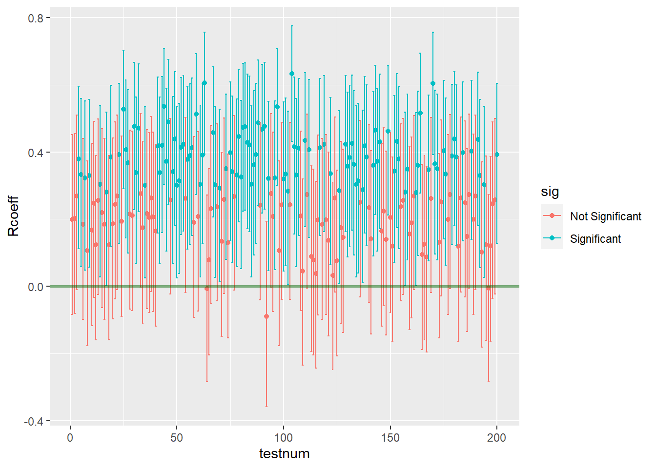
After running the simulated correlation of .30 in the population data (N=10,000), and testing it across 200 study samples of 100 individuals each randomly drawn (without replacement) from that population, I found that the correlation was correctly estimated as non-zero across 169 of the 200 studies.
We can figure out power for a simple design like this one simply by checking a standard power table. (see page 23 here, but any other will do)).
Recall that we have:
- Population Effect Size: R = .30 (R is technically referred to as “rho” in the population)
- Sample Size: n = 100
If we assume alpha = .05, two-tailed (which, yeah, we are), then power is about .855 to detect the population correlation of R = .30 with any 100 random observations we drew from that population (this, again, is based on a standard power table for Pearson correlations, reproduced below for ease).

This is roughly consistent what we found based on the empirical demonstration – in the above example, the correlation test was significant at p <.05 in 169 of the 200 simulated random samples from the population (that is, 84.5% of the random samples resulted in a significant correlation, so our empirically observed power here was .845).
Importantly, I extracted and used information regarding the confidence intervals around each of the 200 estimates across all of the random samples. This move allowed me to plot every estimate and visualize exactly how often the confidence interval around an estimate included zero (i.e., how many estimates were incorrectly indicating that the population correlation could actually be zero, when we know for a fact that it’s r = .30). Here’s what that graph looks like:

Effects of sample size adjustments
Power is directly affected by sample size, as is statistical significance, as we can demonstrate pretty easily by tweaking this process. If we run another set of simulated samples, but this time set our sample size at 50, two things will happen:
- Power will decrease, resulting in fewer significant results across all 200 samples.
- The precision of each estimate will decrease, resulting in larger confidence intervals (and therefore fewer significant results) across all 200 samples.
I ran the program code again with the above adjustments, and what I found was that the number of tests that correctly estimated the population correlation as non-zero dropped to 107 out of 200. You can clearly see that things got worse by looking at the new graph of estimates across all studies below.
Looking at the results, we can pretty clearly see both of the things I mentioned.
- Power will decrease, resulting in fewer significant results across all 200 samples – There are far more red estimates that are non-significant, now that the sample size has been halved. Because only 107 out of 200 tests were significant (or 54%) our observed power has decreased from .85 to about .54 (based on a standard power table, we would expect power of .56 for this design, so what we observed is in the same neighborhood). See below for ease.

- The precision of each estimate will decrease, resulting in larger confidence intervals (and therefore fewer significant results) across all 200 samples. – If we look closely at the Y axis for this 2nd figure, we can see that the upper and lower limits of the confidence intervals have gotten wider than they were in the previous example. This happens because the lower sample size in each sample makes the estimated correlations in each sample less precise – the standard errors get larger, which in turn increases the sizes of all the confidence intervals. (Coincidentally, another consequence of these enlarged standard errors is apparent in the graph too – the estimates are more widely dispersed than they were before. Notice in the 2nd graph some estimates are as high as r= .60 or higher, while a few are even negative. Yikes.)
In fact, I quickly calculated the average width of the intervals for each simulation set, just to double check. When the sample size was 100, the average width of the confidence interval was .36. However, when we cut the sample size in half, the average width of the confidence interval increased to .50.
Practical/teachable implications of power, sample size, and NHST
The process we’ve just seen has several practical implications that help us understand why power matters and why significance testing can be a problematic standard in research.
- With an average interval width of .50, if we ran a real study of these two variables and we had only 50 people in the sample, we’d have to hope that the estimated correlation that we get from our data was at least as large as .40 or more (anything around .30 would be pushing it), or else the interval would run a nontrivial risk of including zero (and thus be non-significant). Which means…
- By extension, in order to publish this work, we would be hoping that our test will overestimate the magnitude of the actual correlation in the population (even if we aren’t aware that our significant finding is an overestimate, we still need it to be an overestimate to have a better probability of attaining significance). Put differently, the only way this finding would have a fighting chance of being published in most outlets is if it is demonstrably inaccurate. This is a bad state of affairs, and it’s a direct consequence of the strong emphasis on significance testing and “significant findings” that exists in so many scientific disciplines.
- By further extension, on the off chance that we did manage to run one of those underpowered studies that attained significance at r = .40 anyway, and if this flawed finding did get published, there would now be a published study out there that is incorrectly claiming that there is a stronger correlation between X1 and X2 in this population than the one that actually exists. This is bad for several reasons. First, other researchers might see this result and begin planning research of their own, chasing after a correlation that isn’t actually as large as it seems, or formulating new research questions based on this faulty finding. Second, if this finding has any real world implications – think, those that might affect public policy, industry practices, or people’s general quality of life – then there are large segments of the public who would end up unknowingly acting on this flawed finding in good faith. These outcomes both result in potentially large wastes of time, money, and labor, and can negatively affect people’s lives.
- As I say often, confidence intervals are better than p values. This demonstrates why – even if we did get lucky1 enough to find a correlation of, say r = .40, at least if we provided confidence intervals instead of p values, readers would be inclined to focus on the fact that the interval around that estimate was pretty wide (e.g., with an average interval width of .50 we might get a result such as r = .40, CI.95 [.15,.65]). With an interval like that, we’re effectively saying that the real correlation in the population could be as small as .15 (fairly small) or as large as .65 (an uncommonly strong correlation). What would even be the point of such an all-encompassing (and frankly, useless) statement, really? It would be akin to placing a bet on a football game, wagering that your team will score somewhere between 3 points and 70 points. Would anyone take that bet? Probably not. Unless they dislike their money.
1 I mean “lucky” in the sense that we’d be able to publish the paper and get that sweet line on our CV. Not “lucky” as in we actually made a meaningful contribution to the field.
In Conclusion
I hope that this quick empirical demo has helped you get a better feel for how power relates to sample size adjustments, and what the concept of power is concretely about in practice. I also hope that you’re looking at significance testing in a more critical light, if you weren’t already. If you’re looking to teach similar concepts or wanting to learn by tinkering around with the process, feel free to copy and modify my code as needed. This application can be pretty easily adapted to other common power scenarios (e.g., power for a one-sample t test, power for a one-way ANOVA).
There are other cool ways to use data simulations to answer questions about power and sample size that I might cover in a future piece if time permits (e.g., running Monte Carlo simulations in Mplus to conduct power analysis for multigroup structural equation models with simultaneous outcomes). For now, hope this one helps!
Be safe & be kind. Peace ✌🏾
Below: Batched R code to run simulations described above:
#mount required packages
require(mvnorm)
require(MASS)
require(dplyr)
require(ggplot2)

#simulate population data
N <- 10000
mu <- c(2,3)
sigma <- matrix(c(9, 3.8, 3.8, 16),2,2)
set.seed(03112021)
pop.data <- data.frame(mvrnorm(n=N, mu=mu, Sigma=sigma))

#define adjustable parameters
Nsampsize = 100 #this is the size of each random sample (default 100)
Nrandsamps = 200 #this is the number of random samples to be drawn (default 200)

#create an empty list object to store the results of each test
results = list()

#use a for loop to extract coefficients and CI values
for(i in 1:Nrandsamps) {
  tempsample <- sample_n(pop.data, Nsampsize)
  tempcor <- cor.test(tempsample$X1, tempsample$X2)
  CI  <- as.data.frame(tempcor$conf.int)
  Rcoeff <- as.numeric(tempcor$estimate)
  CIlow <- CI[1,1]
  CIhigh <- CI[2,1]
  tempdata <- data.frame(cbind(Rcoeff, CIlow, CIhigh))

  #add this iteration of tempdata to the results list
  results[[i]] <- tempdata

}

  #bind all results into a single data frame
    results.data = do.call(rbind, results)

 #add the test numbers to the data set.
    testnum = seq(1,nrow(results.data))
    results.data<- cbind(testnum, results.data)

#compute a variable to denote significance at p <.05
results.data$sig <- NA
results.data$sig [results.data$CIlow < 0 & results.data$CIhigh > 0] <- "Not Significant"
results.data$sig [results.data$CIlow > 0 & results.data$CIhigh > 0] <- "Significant"
results.data$sig [results.data$CIlow < 0 & results.data$CIhigh < 0] <- "Significant"

#tabulate the results
table(results.data$sig)

#plot the results
coeff.plot <- ggplot(data = results.data, aes(x=testnum, y=Rcoeff, color=sig))+
      geom_point()+
      geom_errorbar(aes(ymin=CIlow, ymax=CIhigh))+
      geom_hline(yintercept=0, size=1, color="darkgreen", alpha=.5)

coeff.plot

You must be logged in to post a comment.